APNIC E-LEARNING PLATFORM
Overview
(Contact me for staging view of the website)
APNIC Academy is the learning platform for the Asia Pacific Internet community — think Coursera, but purpose-built for network engineers and internet infrastructure professionals, combining self-paced courses, instructor-led training, virtual labs, certification, and eduroam Wi-Fi access into one platform.
I led the end-to-end redesign of Academy — from platform architecture to course-design methodology — taking it toward Academy 3.0. We are going through a full redesign, from our platform to our course curriculum – such as courses, workshops and conference events.
The problem
Two business pressures converged:
Free access was being exploited: duplicate accounts, fake attendance, seat-limit bypass - was putting APNIC's ability to keep Academy free and open for genuine members at risk.
Academy needed to be monetisation-ready: certification fees, enterprise seats - without compromising the free, community-first learning experience APNIC is known for.
Our own research backed this up with a UX-specific finding: across 255 pieces of training feedback collected between January and May 2024, 54 (21%) cited scheduling and timing as a pain point. That told us the course structure itself - not just content quality - was actively costing us learners.
My role
I was the primary designer across Academy's redesign: information architecture, course-design methodology, user research, interaction design, and Academy's contribution to Fibre, APNIC's org-wide design system. I worked directly with the Academy PM and Delivery Manager, partnered with the Product UX team on cross-product consistency, and ran design reviews through APNIC's UX Guild.
Key decision: modularisation vs schedule-based course design
The feedback data pointed to a structural problem, not a cosmetic one. I built the case for restructuring courses around self-contained modules learners could sequence themselves, rather than a fixed weekly schedule - benchmarking against how platforms like Coursera and edX structure modular learning paths, and grounding the recommendation in learning-science research on modular vs. linear course design.
Rather than committing engineering time on the strength of a hypothesis, I designed and ran a moderated A/B test:
Hypothesis: a modularised sidebar would outperform a fixed-schedule sidebar on engagement and satisfaction
Participants: 10 (5 new users, 5 existing Academy members), recruited through APNIC's User Feedback Group
Method: 30–40 min moderated sessions; each participant used both prototypes, completed representative tasks, and rated satisfaction, ease-of-navigation, and stated preference, followed by open qualitative feedback
Analysis: task completion rate, satisfaction scoring, and thematic analysis of open-ended responses
Validating the full platform: Academy 3.0 usability testing
Beyond the sidebar decision, I scoped and ran a full usability pass across Academy 3.0's critical path: public landing pages and value-proposition clarity, Okta-based authentication and onboarding, the personalised home experience, discovery/search/filtering, four distinct enrollment types (self-paced, instructor-led, invite-only, third-party handoff), the learning-and-certification flow, and contributor/admin (CMS) workflows.
10 moderated sessions (5 mobile, 5 desktop), split across new and returning users, with findings scored against a severity model - critical-path impact × recurrence × difficulty to recover without help - so results could be triaged into Critical / Should-fix / Nice-to-have instead of a flat list of bugs.
UX Documents (will open a new tab)
The Case for Modularisation in Course Design
A/B Testing Plan: Modularisation vs Schedule-based design
Process
Every major feature moved through a defined lifecycle rather than going straight to screens:
Discover (journey mapping of existing behaviour) → Ideate (structured design-thinking sessions with PM/DM) → Define (IA mapping — content inventory, sitemap, tree testing) → Design (user flows → low/mid/high-fidelity wireframes) → Develop (structured handover: specs, flows, breakpoints, accessibility, data validation) → Test (design QA against implementation).
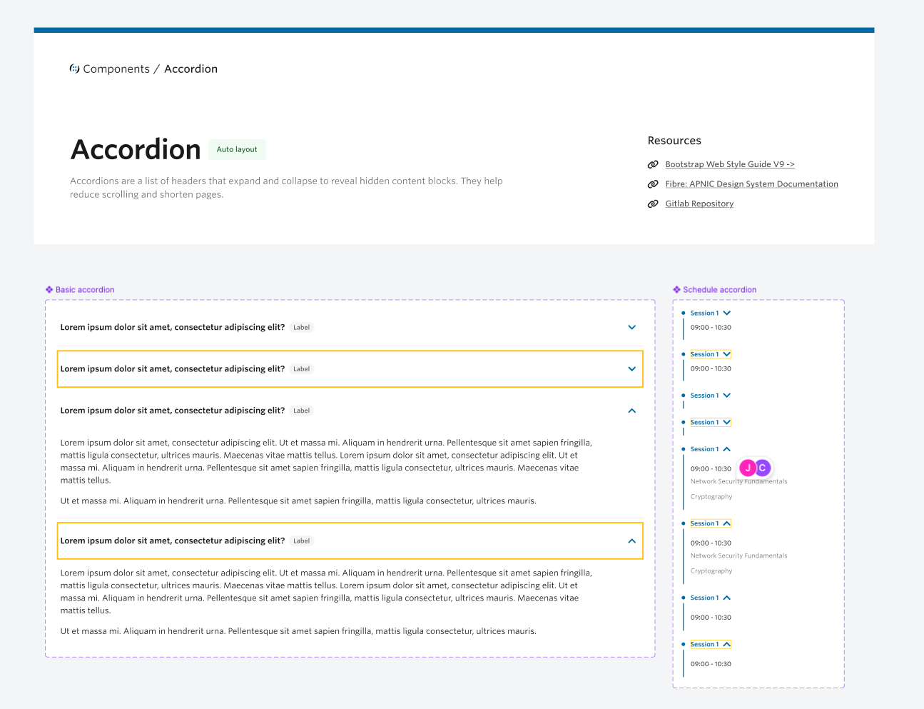
Two checkpoints ran through every stage of Design: a cross-functional review with APNIC's UX Guild, and a systems check against Fibre — so nothing shipped in isolation from the rest of APNIC's product suite.

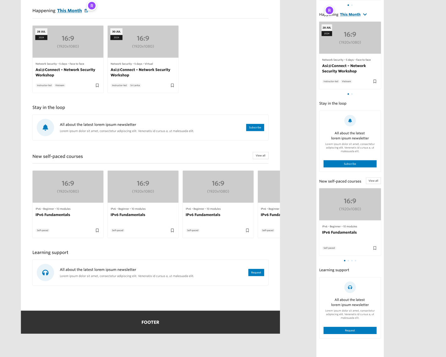

partial design system
〰️
partial design system 〰️